


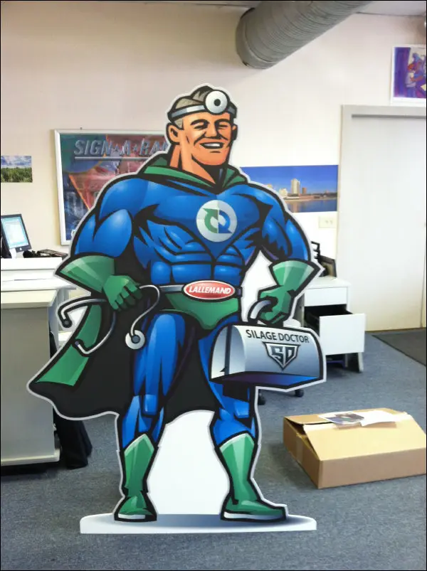


Interior signage is more than a design element it’s a functional, compliance-driven communication system that shapes how people interact with your business. From helping visitors find their way to reinforcing brand identity, interior signage directly impacts customer satisfaction, operational efficiency, and even legal compliance.
For Milwaukee businesses and commercial property managers, investing in thoughtful, well custom designed signage is essential for delivering a seamless, accessible, and brand-consistent experience. In this guide, we’ll explore the most effective interior signage ideas, design tips, and placement strategies to help you create better environments for your employees, tenants, and customers.
Why Interior Signage Matters in Commercial Spaces
The Link Between Signage and User Experience
Every sign inside your building plays a role in shaping the visitor’s journey whether they’re navigating a multi-floor office, visiting a clinic, or checking into a hotel. Poor signage results in frustration, delays, and unnecessary questions. Clear, consistent signage enhances user comfort, builds confidence, and ensures that people can move through your space intuitively.
From entry to exit, each sign should inform, direct, or reassure contributing to a smooth, welcoming customer experience.
First Impressions and Flow in Large Facilities
First impressions begin the moment someone walks into your building. A polished reception sign, intuitive directory, and clear directional signage create an immediate sense of organization and professionalism. In large or complex facilities like medical centers, corporate offices, and educational campuses, effective interior signage is essential for managing foot traffic and reducing confusion.
Don’t Miss: What Are the Best Materials for Exterior Signs in Milwaukee?
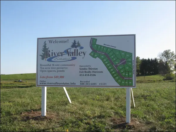
Key Types of Interior Signage for Milwaukee Businesses
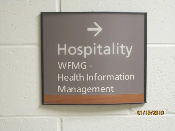
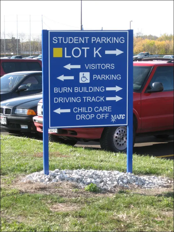
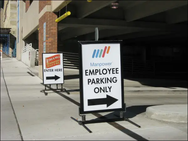
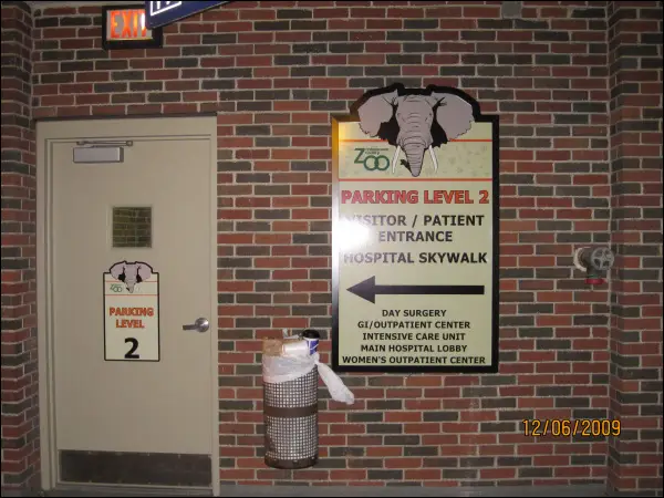
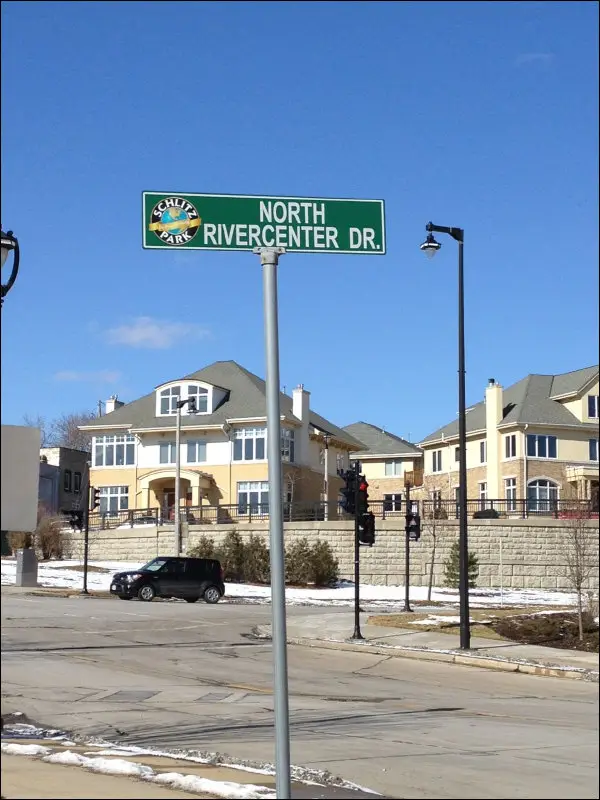
Wayfinding Signs: Navigating with Ease
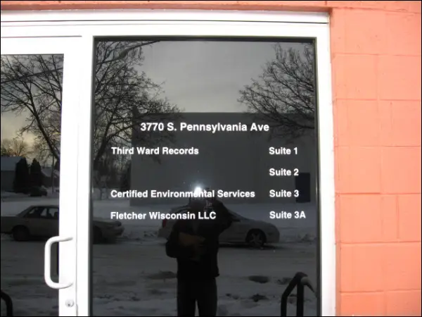
Wayfinding signage guides visitors through unfamiliar spaces, helping them locate departments, meeting rooms, restrooms, elevators, and exits. These signs play a vital role in reducing bottlenecks and improving traffic flow, especially in buildings with multiple floors or wings.
Common types include:
- Directional arrows and hallway guides
- Floor directories or lobby-mounted maps
- Color-coded zones or numbered room systems
Wayfinding signs should be consistent in design, placed at key decision points, and easy to read from a distance.
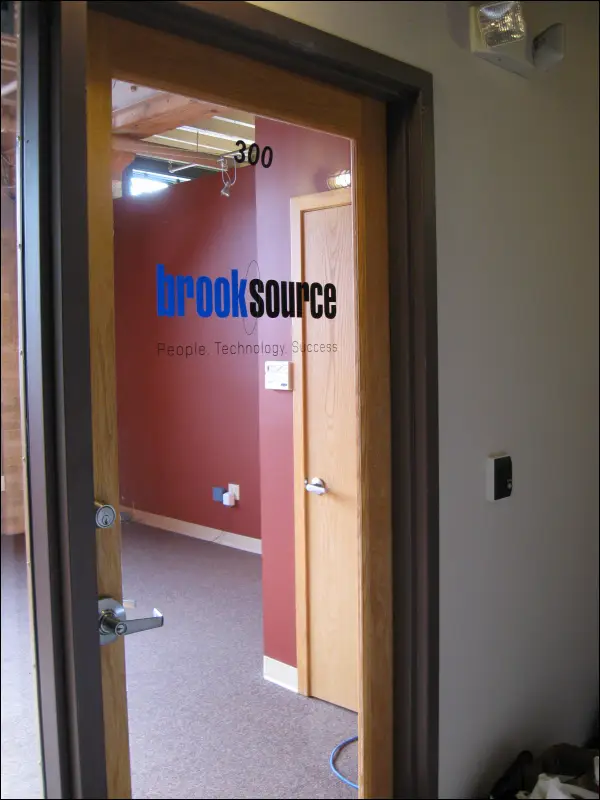
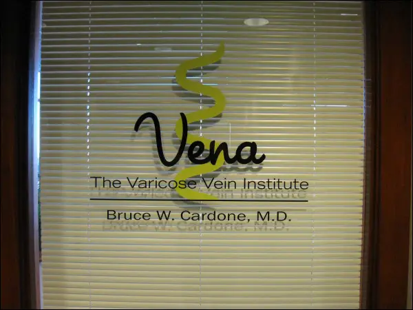
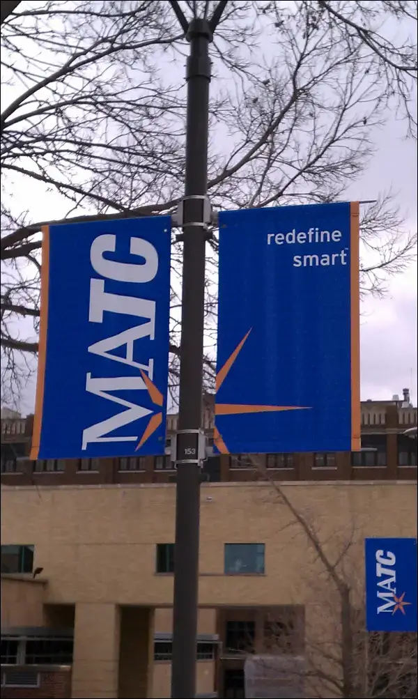
Reception and Lobby Signs: Brand Presence Starts at the Door
Your lobby is the heart of your brand experience. A high-quality reception sign welcomes guests, reassures clients, and sets the tone for your company culture. These signs often feature:
- Dimensional lettering
- Acrylic or brushed metal panels
- Backlit or halo-lit effects
Branded reception signage should reflect your company’s visual identity, colors, fonts, and logos, and be mounted prominently behind the main desk or entry wall.
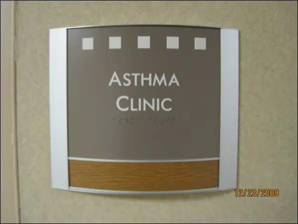
ADA-Compliant Signs: Accessibility and Legal Compliance
All businesses are required to follow the Americans with Disabilities Act (ADA) guidelines for signage, especially in public or commercial buildings. ADA-compliant signage includes:
- Braille and tactile lettering
- High-contrast colors
- Proper font and sizing
- Mounting height and location regulations
These signs must be installed near restrooms, exits, stairwells, elevators, and room entrances. ADA signage not only ensures inclusivity and accessibility, but also protects your business from compliance issues and legal risks.
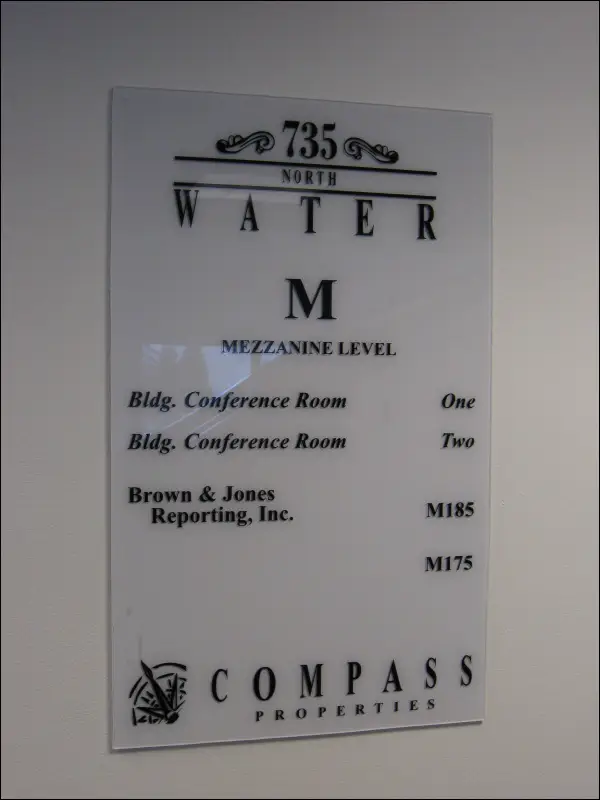
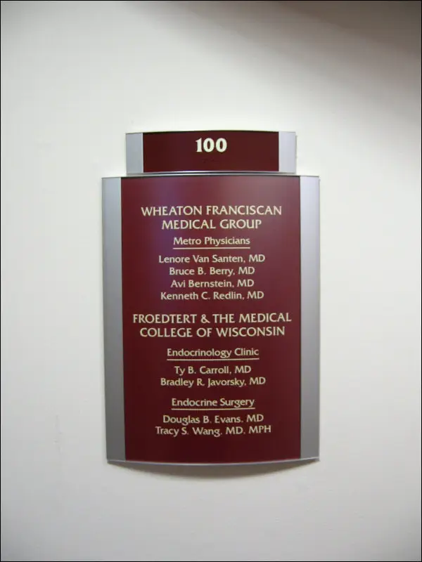
Office and Department Nameplates
Clearly identifying rooms and departments enhances internal navigation and professionalism. Nameplates for offices, meeting rooms, and departments should align with your broader sign system in both design and placement and be easily changeable if roles or room functions evolve.
Modular sign systems with interchangeable inserts are ideal for offices that undergo frequent reassignments.
Best Practices for Sign Design and Placement
Font, Contrast, and Readability
Clear typography is essential for effective signage. Sans-serif fonts, such as Helvetica or Arial, are highly legible from a distance. Use sufficient contrast such as white text on a dark background or black on light to ensure readability in varying lighting conditions.
Text size should be large enough to read from standard viewing distances:
- 1” letter height for every 10 feet of viewing distance
- Avoid overly decorative or script-style fonts for functional signs
Positioning for Foot Traffic and Visibility
Signs should be placed at eye level and positioned where people naturally pause or make decisions, such as hallway intersections, elevators, and outside doorways. Ensure signage isn’t obscured by furniture, décor, or glare from overhead lighting.
For larger facilities, consider wall-mounted vs. ceiling-mounted signs based on line-of-sight and room dimensions.
Durable Materials for High-Traffic Areas
Interior signs in busy environments need to withstand daily wear and tear. Recommended materials include:
- Acrylic for modern, polished finishes
- PVC and aluminum composite for durability
- Laminated prints for directories or temporary signage
Choose materials that are scratch-resistant and easy to clean, especially in high-touch environments like medical offices or public restrooms.
Read Also: How Custom Business Signs Boost Your Milwaukee Brand Visibility in 2026?
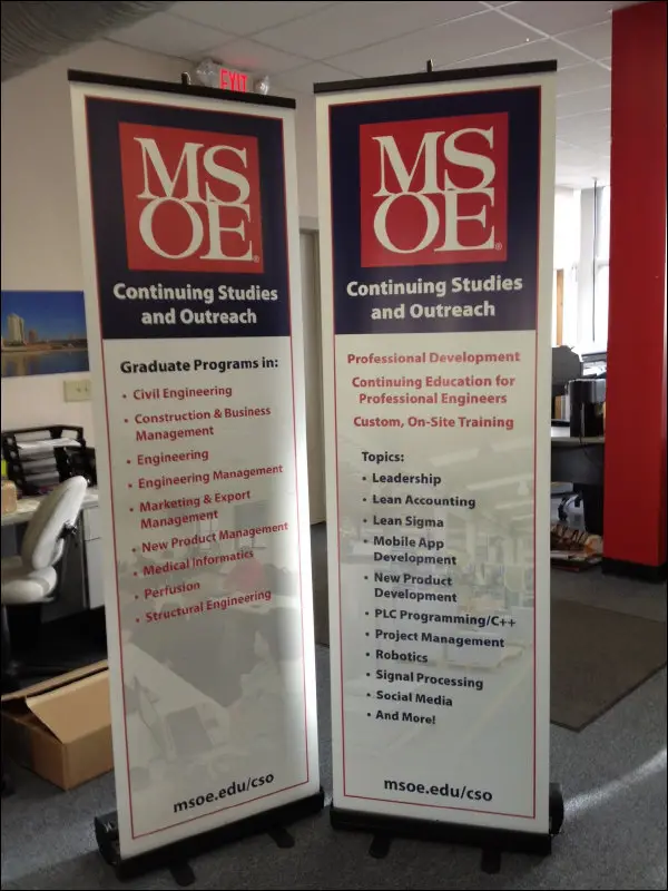
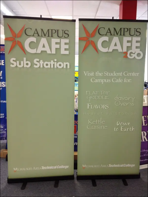
Enhancing Brand Identity Through Interior Signage
Color, Logo, and Tone Consistency
Consistency is key when integrating branding into signage. All interior signs should reflect your core brand elements logo usage, typography, brand colors, and tone of voice. Whether minimal and sleek or colorful and playful, the sign system should reinforce the emotional message of your brand.
For example:
- Corporate offices may opt for neutral tones with metal or acrylic signs
- Creative agencies may use bold, colorful designs
- Medical centers often use calming color palettes with clean fonts
Creating a Cohesive Visual Experience
Branded signage should create continuity across the entire building. From entryways to private offices, every sign should feel like part of a cohesive visual system. This unified approach not only strengthens your brand but also makes navigation intuitive — reducing friction and confusion for employees and visitors alike.
Conclusion
Interior signage isn’t just decoration it’s an essential tool for enhancing customer experience, promoting brand identity, and maintaining compliance. For Milwaukee businesses and commercial properties, the right signage system can streamline visitor flow, reduce confusion, and leave a lasting impression of professionalism and care.
By investing in clear wayfinding signs, bold reception displays, ADA-compliant markers, and brand-aligned visuals, you create an environment where customers and employees feel confident and comfortable.
If you’re ready to elevate your interior spaces with professional signage solutions, consult a Milwaukee signage expert who understands how to merge design, function, and local compliance seamlessly.
Frequently Asked Questions
What are the most important interior signs in an office building?
The most critical signs include reception signs, wayfinding directories, room identification, restrooms, exits, and ADA-compliant markers. These signs ensure navigation, safety, and a welcoming first impression.
How do ADA sign requirements affect design?
ADA signs must meet strict standards for font style, tactile lettering, Braille, contrast, and mounting height. They often need to be installed next to doors, elevators, stairwells, and restrooms, and must not rely solely on visual cues.
What materials last longest for interior signage?
Acrylic, PVC, and aluminum composite materials are commonly used for their durability, resistance to moisture and scratches, and clean finish. Laminated prints or changeable modular inserts are ideal for nameplates and directories.
Can interior signs help reduce visitor confusion?
Absolutely. Clear, strategically placed signage helps visitors navigate independently, reducing questions, wait times, and stress. Effective signage improves overall satisfaction and enhances your business’s reputation.