










































A business can have an attractive logo and a well-designed building yet still be difficult to find from the street. That usually points to a signage problem rather than a branding problem.
Choosing building signs should begin with how people actually approach the property. A driver moving past the building needs to recognize a business differently from a customer walking along a storefront. A company that works at night needs different visibility than an office that sees visitors mostly during the day.
That is why the best sign is not automatically the largest, brightest, or most expensive option. The right choice depends on several factors: viewing distance, building style, brand, operating conditions, installation needs, and the sign’s purpose.
Key Takeaways
- Start with viewing conditions and identification needs, not a preferred sign style.
- Channel letters provide excellent visibility for businesses. They are ideal for clear facade identification, especially when illuminated.
- This version is more direct and professional while keeping the original meaning.
- Dimensional letters can provide depth and brand presence without requiring internal lighting.
- Monument signs can solve visibility problems when the building sits too far from the road.
- Blade or bracket signs can be useful when customers approach parallel to the storefront rather than directly toward it.
- Sign size isn’t the only factor for visibility. Contrast, placement, letter shape, lighting, and nearby clutter also play a role.
- Consider installation conditions and sign requirements during design, not after fabrication.
- Compare sign proposals based on construction, lighting, materials, installation scope, and site conditions. Don’t focus on price alone.
Table of Contents
- Start With the Visibility Problem
- How the Main Building Sign Types Differ
- When Illuminated Signage Makes Sense
- What Actually Makes a Building Sign Easy to See
- Match the Sign to the Building
- Choose Materials for the Application
- Plan for Installation Before Fabrication
- What Affects Building Sign Cost
- Common Building Sign Selection Mistakes
- A Practical Building Sign Decision Guide
- Building Sign Planning in Milwaukee
Start With the Visibility Problem
Before comparing sign materials or lighting styles, determine what the sign must accomplish. A primary identification sign has a different job from a directional sign. A storefront facing a sidewalk has different needs from a commercial building positioned behind a parking lot. A multi-tenant property might require signs at various spots before a visitor finds the right entrance.
Ask these questions first:
- Where will customers first look for the business?
- Will they be walking or driving?
- From what direction will they approach?
- How far away should the business be recognizable?
- Does the sign need to remain visible after dark?
- Is the building itself easily visible from the road?
- Is the primary goal identification, branding, direction, or a combination?
These answers eliminate unsuitable options much faster than starting with a catalog of sign styles.
How the Main Building Sign Types Differ
Several types of commercial signage can identify a building, but they do not solve the same problem.
Channel Letter Signs
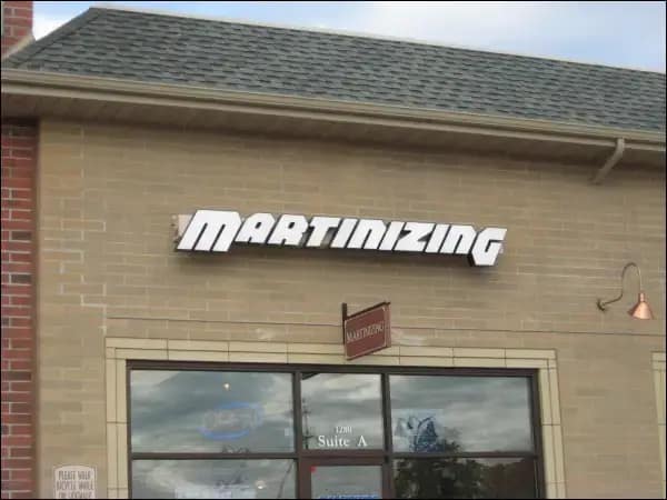
Channel letters use individually fabricated letters or logo elements mounted to the building. They can provide cla road or parking area.
- The business wants individually formed letters rather than one rectangular sign face.
- Nighttime identification matters.
- The brand translates well into larger individual lettering or logo components.
They are often linked to storefronts, restaurants, retail shops, and other commercial properties. Here, the facade serves as a key identification point.
Dimensional Letters and Logos
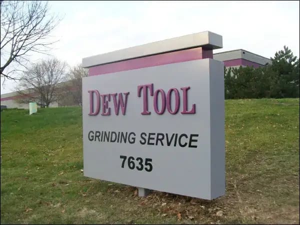
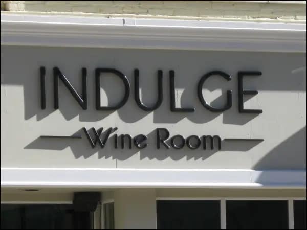
Dimensional lettering creates physical depth without necessarily placing lighting inside each character.This method is great for companies wanting a clean architectural look. It works best when the site doesn’t need illuminated letters.
Material, thickness, finish, and mounting method all affect the final look. Background contrast and external lighting also play a big role.For an office or commercial property, dimensional lettering is easy to see in daylight. This option avoids the need for extra electrical components.
Cabinet Signs
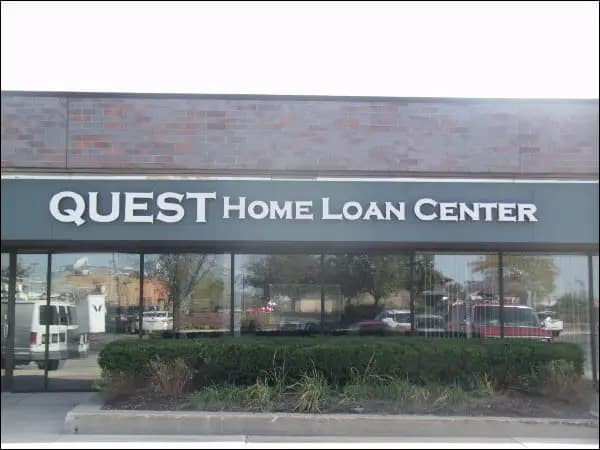
A cabinet sign contains the sign face and supporting structure within a defined enclosure.One advantage is that names, logos, and graphic elements can be contained within a single sign unit. Illuminated versions can also provide visibility after dark.
A cabinet is visually different from individual letters, however. It creates a larger solid shape on the facade.That may suit one building well and feel too heavy on another. The choice should focus on the architecture and brand. Don’t assume one construction style is better for everyone.
Storefront Signs
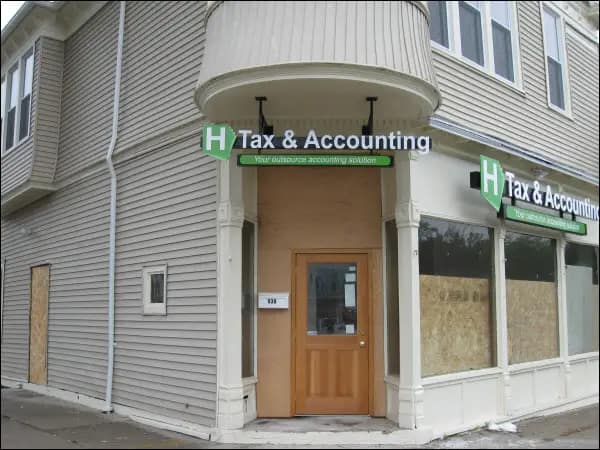
“Storefront sign” describes a location and purpose for more than one specific fabrication method.A storefront could use channel letters, dimensional lettering, a cabinet, projecting signage, window graphics, or several coordinated elements.
The important question is how customers encounter the storefront.
A sign flat against the wall is easy to see from a distance, like across a parking lot. But, it’s not very helpful for pedestrians walking alongside the businesses.
Blade and Bracket Signs
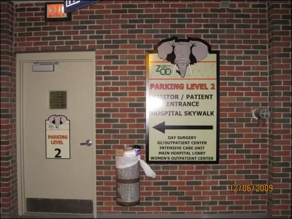
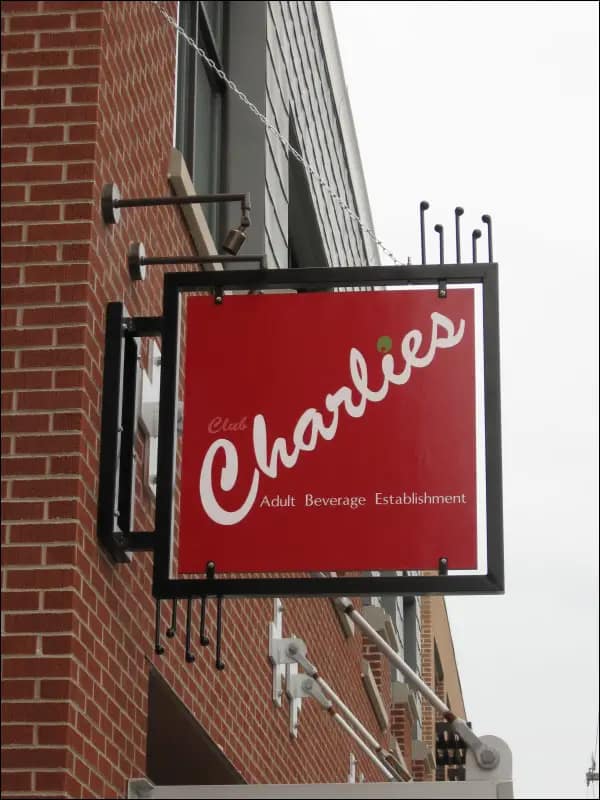
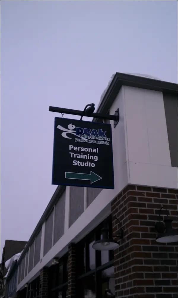
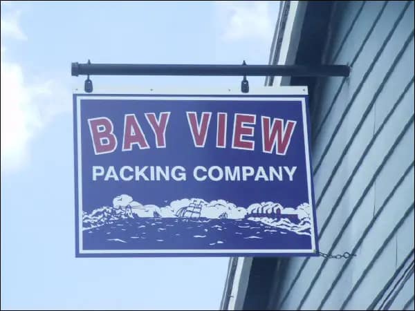
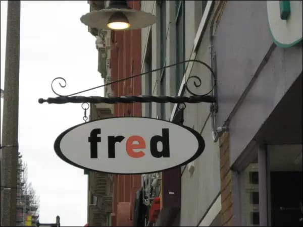
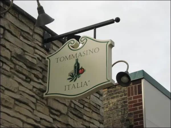
Blade and bracket signs project outward from the building rather than remaining parallel to the facade.That changes the viewing angle. They are especially helpful in areas where people walk. Someone strolling by might miss a wall-mounted sign until they are right in front of the business. A projecting sign can therefore complement rather than replace primary facade identification.
Monument Signs
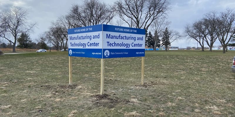
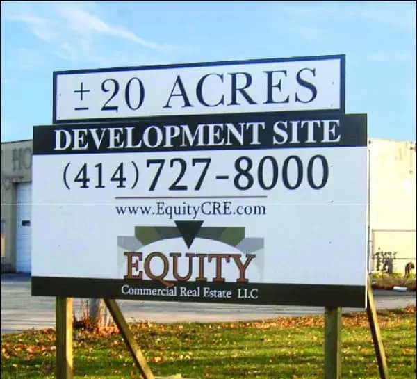
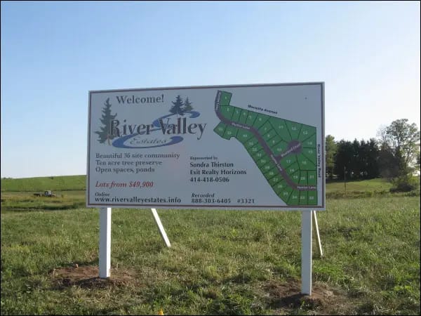
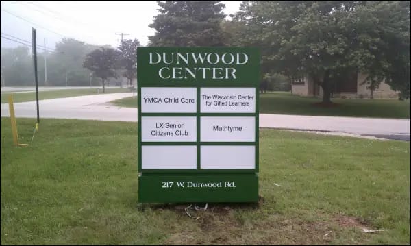
A building may have a perfectly good facade sign and still be difficult to identify from the road.That often happens when the property sits behind a setback, landscaping, parking area, or other structures. A monument sign moves identification closer to the point where drivers need it. For office buildings, commercial sites, industrial spaces, institutions, and multi-tenant properties, roadside visibility may be more important than simply enlarging the facade sign.
Post-and-Panel Signs
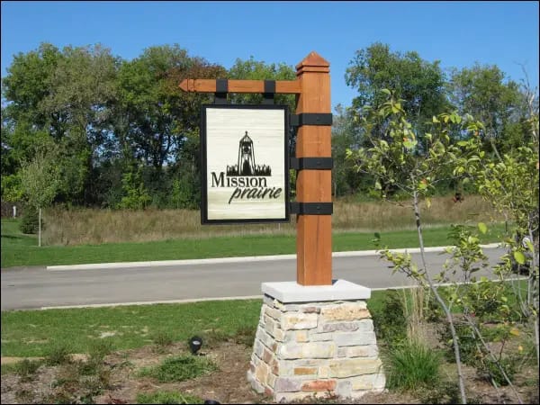
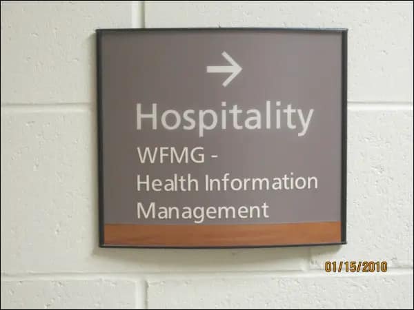
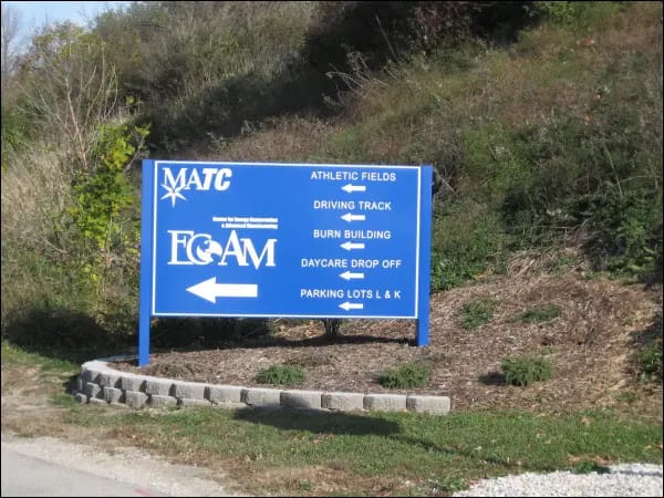
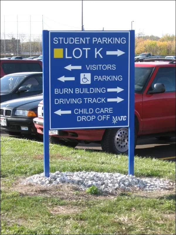
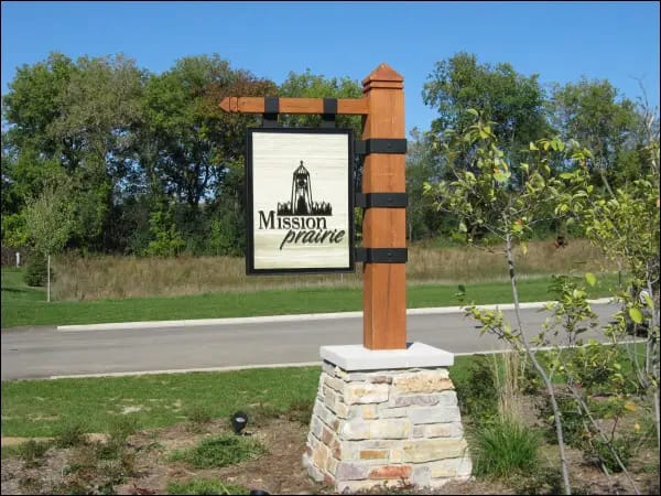
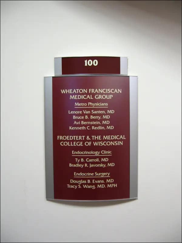
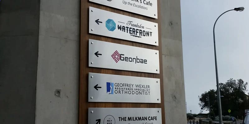
Post-and-panel signs can support property identification, entrance information, directional communication, and other exterior needs. Their usefulness depends on placement and purpose. A post-and-panel sign positioned near an entrance, for example, can solve a navigation problem that additional lettering on the building itself would not address.
When Illuminated Signage Makes Sense
Lighting should solve a visibility requirement—not simply make a sign appear more elaborate. Illuminated building signs are more valuable when customers come by at night. They help the property stand out and stay recognizable after dark.
Possible illuminated approaches can include front-lit letters, halo-lit configurations, internally illuminated cabinets, and other designed lighting methods. Non-illuminated signs work well for businesses that mainly operate during the day. They’re also good when the site has enough lighting.Before deciding, evaluate the property at the time customers will actually see it. A sign with strong daylight contrast may become difficult to distinguish after sunset. The reverse can also happen: an excessively bright sign can feel disproportionate to its surroundings. Lighting should be part of the original sign strategy. It shouldn’t be an upgrade added later, after the design is chosen.
What Actually Makes a Building Signs Easy to See
Making a sign larger is not always the best visibility solution.
Recognition is affected by several interacting factors:
- Viewing distance
- Letter height
- Letter shape
- Color contrast
- Mounting height
- Traffic direction
- Sign orientation
- Lighting
- Background materials
- Nearby signs
- Landscaping
- Architectural obstructions
A small sign with high contrast can often work better than a bigger one against a cluttered background. Information overload creates another problem.A main building signs doesn’t need to list every service, phone number, website, slogan, certification, or promotion.A person moving past a property has limited time to process information. The first job is usually simple: make the business recognizable. Secondary information can be handled elsewhere when needed.
Match the Sign to the Building
A sign should look as though it belongs on the property. That requires evaluating the facade before finalizing the design.
Consider:
- Available wall area
- Exterior materials
- Windows
- Architectural lines
- Existing lighting
- Building proportions
- Possible mounting locations
- Visibility from different approaches
A sign that appears appropriately sized on a design proof may feel very different once installed several feet above ground level. The reverse is also possible. Oversizing a sign without considering the facade can make the signage dominate the architecture rather than work with it. The design process should therefore evaluate the sign and building together.
Choose Materials for the Application
There is no universally “best” material for exterior business signage. Aluminum, acrylic, metal, plastics, vinyl, and other sign materials have different uses. Their purposes depend on factors like construction, finish, depth, lighting, exposure, mounting, and appearance.
Material choice should follow the sign design and operating conditions. For example, the material priorities for individual dimensional letters may differ from those for an illuminated cabinet or a post-and-panel system.
Instead of asking only:
“Which material lasts longest?”
ask:
“What material and fabrication method should be used for this sign? Consider the location, finish, and exposure.”That produces a more useful specification.
Plan for Installation Before Fabrication
Installation is not the final step of the design process. It is one of the conditions that should shape the design.
Important considerations may include:
- Wall construction
- Mounting surface
- Installation height
- Equipment access
- Electrical access for illuminated signs
- Sign weight
- Existing facade conditions
- Physical site access
- Applicable sign requirements
Ignoring these factors early can create a sign that looks good in a rendering but becomes unnecessarily difficult to install. For custom signage, design, fabrication, and installation are connected decisions. A change in one can affect the others.
What Affects Building Signs Cost?
Two signs with similar overall dimensions can have very different project scopes.
Major cost drivers can include:
- Sign size
- Number of fabricated components
- Illumination
- Electrical requirements
- Material selection
- Logo complexity
- Letter depth
- Finishes
- Mounting method
- Installation height
- Site access
- Building conditions
- Installation equipment requirements
For example, custom-made illuminated letters are different from non-illuminated dimensional letters. The latter is usually installed at an easy-to-reach height. That is why comparing quotes only by total price can be misleading.
When reviewing proposals, confirm whether they are based on comparable:
- Construction methods
- Materials
- Lighting
- Finishes
- Mounting
- Electrical work
- Installation scope
A lower headline price is not necessarily the lower-cost option if important project elements have been excluded.
Common Building Signs Selection Mistakes
Choosing a Sign Style Before Studying the Property
A business may like a particular sign type because it saw one elsewhere.That does not mean the same solution fits its own building.Start with the property, viewing conditions, operating hours, and branding. Then narrow the sign options.
Designing Only for Close-Up Appearance
Sign proofs are viewed from a few inches away on a screen.Customers may see the finished sign from dozens or hundreds of feet away.Fine details that look attractive in artwork can disappear at real-world scale and distance.
Adding Too Much Information
Exterior identification is usually more effective when recognition happens quickly.If every available space is filled with text, the sign can become harder—not easier—to understand.
Ignoring the Approach Direction
A sign may technically face the street while still being poorly positioned for actual traffic movement.Think about how visitors approach rather than simply where the building faces.
Treating Installation as an Afterthought
A concept should be feasible for the actual wall, mounting surface, height, access, and electrical conditions.Installation constraints discovered late can force avoidable redesign.
Assuming Illumination Is Always Better
Lighting has a purpose.If identifying things at night isn’t important, adding lights can make it harder. It won’t really solve any visibility problems.
A Practical Building Signs Decision Guide
- Define the job.
- Identify the viewing point.
- Determine viewing conditions.
- Evaluate the building.
- Simplify the message.
- Select the sign family.
- Evaluate the lighting.
- Review fabrication and installation.
Instead of selecting signage by appearance alone, work through the decision in this order:
1. Define the job.
Is the sign mainly for identifying the business, attracting attention, guiding visitors, or improving visibility on the road?
2. Identify the viewing point.
Where will customers first need to recognize it?
3. Determine the viewing conditions.
Walking or driving? Day or night? Close range or long distance?
4. Evaluate the building.
What facade area, materials, architectural features, and mounting conditions are available?
5. Simplify the message.
Determine what customers actually need to recognize.
6. Select the sign family.
Only now compare channel letters, dimensional signs, cabinets, projecting signs, monument signs, and related options.
7. Evaluate lighting.
Add illumination when it solves a real nighttime visibility requirement.
8. Review fabrication and installation together.
Confirm that the design works for the actual site.
This sequence prevents one of the most common planning errors: choosing a product first and trying to make the property fit it afterward.
Building Signs Planning in Milwaukee
Commercial properties throughout Milwaukee and surrounding Wisconsin areas can present very different signage conditions. A street-level storefront, an office building behind parking, an industrial property, and a multi-tenant development need different sign strategies.The local element should come from property and project needs. It shouldn’t just be about adding “Milwaukee” to a generic sign suggestion.
Milwaukee Signs creates custom building signs and exterior signage. Their offerings include:
- Dimensional letters and logos
- Storefront signs
- Monument signs
- Post-and-panel signs
- Bracket signs
- Directional or wayfinding signage
Based on the business information provided, its work includes sign design, fabrication, and installation, and the company states that it has operated since 2003.
For a new project, the useful starting information is not simply “I need a sign.” A better project brief includes:
- The property or building
- Proposed sign location
- Business logo or branding
- Desired viewing distance
- Daytime and nighttime visibility needs
- How customers approach the property
- Any existing signage that must coordinate with the new design
This helps a sign company understand which construction and placement options to evaluate.
Choose the Sign After You Understand the Site
The strongest building signs decision usually begins before anyone selects a material or sign style. First determine who needs to see the business, where they will see it from, when they need to see it, and what they must recognize quickly.
These answers simplify later choices. You can easily decide between channel letters or dimensional lettering, illuminated or non-illuminated signs, facade signs or monument signs, and simple identification or a coordinated signage system.
As part of the Signarama network, Milwaukee Signs can help businesses with new, replacement, and custom signage solutions tailored to their location and branding needs. To start evaluating a project, share details about the building, branding, sign location, and visibility needs. This way, we can consider suitable sign options for the property.
Commonly Asked Questions
Which type of building sign is best for a storefront?
There is no universal storefront choice. Channel letters are great for visibility at night and for facade identification. Dimensional letters fit businesses that want a non-illuminated, architectural style. A projecting sign can also be valuable where pedestrian traffic approaches parallel to the storefront.
Should a building sign include a phone number or website?
Not automatically. For primary identification, too much information can reduce readability. The business name and brand should come first. Any extra info can go elsewhere if needed.
Do building signs need to be illuminated?
No. Illumination should be based on when the business needs to be identifiable. Businesses open after dark often gain more from illuminated signs than those that mostly serve customers in daylight.
Why can two similarly sized signs cost different amounts?
Dimensions are only one part of the project. Factors such as the fabrication method, lighting, number of components, and materials can greatly impact the project. Finishes, installation height, electrical needs, mounting conditions, and site access matter, too.
What should a business prepare before requesting a building sign?
Useful starting information includes the building location, photos of the facade, logo files, desired sign area, visibility goals, operating hours, and any existing signage or property requirements that may affect the project.